v0 prompt for a SaaS landing page
This prompt makes v0 generate a nine-section SaaS landing page as separate React components, so you can regenerate the hero without losing the pricing section. The order follows the sequence buyers actually scan — promise, proof, product, price. Style, palette, type, and motion swap in from the customizer while the structure stays put.
Last updated
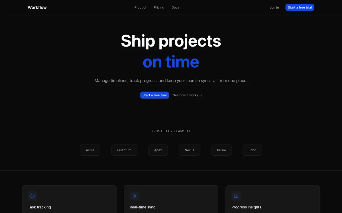
Generate a complete SaaS landing page for {{product}}, aimed at {{audience}}. Build it in Next.js with Tailwind and shadcn/ui, and split every section into its own component (Nav, Hero, SocialProof, Features, ProductShot, PricingTeaser, Faq, FinalCta, Footer) so I can ask you to regenerate one section later without touching the rest.

Sections, top to bottom:
1. Sticky nav — wordmark left, Product / Pricing / Docs links center, ghost login plus a solid CTA button right.
2. Hero — one benefit-led H1 of 8 words or fewer derived from what {{product}} does, a two-line subhead naming the outcome {{audience}} gets, primary CTA beside a secondary "See how it works" text link.
3. Social proof strip — "Trusted by teams at" microcopy above a single row of six grayscale logo placeholders.
4. Feature grid — three cards, each with an icon, a 3–5 word feature name, and a two-line benefit sentence; equal card heights.
5. Product shot — full-width browser-frame mockup of the {{product}} dashboard with a one-line caption.
6. Pricing teaser — two plan cards (one badged as recommended) plus a "Compare all plans" link.
7. FAQ — shadcn Accordion with four questions phrased the way {{audience}} would actually search.
8. Final CTA band — restate the H1 promise in different words, one button only.
9. Footer — four link columns and a newsletter input.

Visual direction:
{{style}}

Palette: {{palette}}
Typography: {{type}}
Motion: {{motion}}

Spacing and responsiveness:
- Section vertical padding py-24, tightening to py-16 below md; internal stacks use gap-6 / gap-12 steps only, nothing arbitrary.
- Below md, the feature grid stacks to one column and the nav collapses into a Sheet menu.

The primary call to action is "{{cta}}" — it appears in the nav, hero, and final band, styled identically each time.

After building, verify: the H1 is under 9 words; all three CTA instances render from one shared component; the logo row stays on one line at 375px; the accordion opens one item at a time; adjacent sections never share the same background treatment.
Customize it
Runs in your browser. Nothing you type here is sent anywhere.
Generate a complete SaaS landing page for a project management SaaS, aimed at engineering managers at startups. Build it in Next.js with Tailwind and shadcn/ui, and split every section into its own component (Nav, Hero, SocialProof, Features, ProductShot, PricingTeaser, Faq, FinalCta, Footer) so I can ask you to regenerate one section later without touching the rest.

Sections, top to bottom:
1. Sticky nav — wordmark left, Product / Pricing / Docs links center, ghost login plus a solid CTA button right.
2. Hero — one benefit-led H1 of 8 words or fewer derived from what a project management SaaS does, a two-line subhead naming the outcome engineering managers at startups gets, primary CTA beside a secondary "See how it works" text link.
3. Social proof strip — "Trusted by teams at" microcopy above a single row of six grayscale logo placeholders.
4. Feature grid — three cards, each with an icon, a 3–5 word feature name, and a two-line benefit sentence; equal card heights.
5. Product shot — full-width browser-frame mockup of the a project management SaaS dashboard with a one-line caption.
6. Pricing teaser — two plan cards (one badged as recommended) plus a "Compare all plans" link.
7. FAQ — shadcn Accordion with four questions phrased the way engineering managers at startups would actually search.
8. Final CTA band — restate the H1 promise in different words, one button only.
9. Footer — four link columns and a newsletter input.

Visual direction:
Minimal dark style. Near-black canvas (#0A0A0B) with one elevated surface tone (#141416) for cards — never more than two surface steps. Hairline borders (1px, white at 8% opacity) instead of shadows; if a shadow is unavoidable use 0 1px 2px rgba(0,0,0,0.4) and nothing softer. Text in exactly three steps: white at 92% for headings, 60% for body, 40% for captions. Generous negative space — section padding at least 120px on desktop, 64px on mobile. The accent color appears only on interactive elements and one hero highlight, nowhere else.

Palette: a strict neutral ramp (white, #F5F5F5, #E5E5E5, #737373, #171717) carries the entire interface; pick one accent and use it only for primary CTAs, active states, and a single hero highlight. If the accent appears more than five times per viewport it stops being an accent. Keep semantic colors (success, error) desaturated so the accent stays in charge.
Typography: one geometric sans (a Futura/Poppins-class face) at three weights maximum (400/500/700). Scale: 64-88px hero, 32px section heads, 18px lede, 16px body, 13px caps labels with 0.08em tracking. Tight headline leading (1.05-1.1), relaxed body (1.6). Let the geometry carry the personality — no italics; weight and size do all hierarchy.
Motion: none. Zero scroll animations, zero entrance effects — the page is fully composed the instant it paints. Spend the motion budget on input feedback instead: 120-150ms ease-out color and transform transitions on hover and press states only. Hold this constraint absolutely; it is a statement, not an omission.

Spacing and responsiveness:
- Section vertical padding py-24, tightening to py-16 below md; internal stacks use gap-6 / gap-12 steps only, nothing arbitrary.
- Below md, the feature grid stacks to one column and the nav collapses into a Sheet menu.

The primary call to action is "start a free trial" — it appears in the nav, hero, and final band, styled identically each time.

After building, verify: the H1 is under 9 words; all three CTA instances render from one shared component; the logo row stays on one line at 375px; the accordion opens one item at a time; adjacent sections never share the same background treatment.
Same task in other tools
Questions about this prompt
Why ask v0 to split every section into its own component?
Because v0 iterates best at component granularity. When the hero misses, you can say "regenerate Hero only, keep everything else" and the other eight files stay stable. One monolithic page file means every retry risks reshuffling sections you already liked.
v0 ignored part of the visual direction — what's the fix?
Re-send just the Visual direction, Palette, Typography, and Motion lines with the instruction "restyle the existing components without changing structure or copy." v0 treats short follow-ups as edits, so isolating the style block gets it applied without a full rebuild.
Can I move the output into an existing Next.js app?
Yes. The components are plain Tailwind plus shadcn/ui, so copy them into your components directory, run the shadcn CLI for any primitives you're missing (Accordion, Sheet, Button), and mount the sections on a route. Nothing depends on v0's runtime.
Part of the v0 landing-page cluster — start from the main v0 landing page prompt.